Forms
The Forms and Actions system in Cetegra Catalog enables a wide range of use cases — from simple comment fields to advanced product configuration and workflow automation.
Submit actions can send emails or SMS, add or remove users from AD groups, trigger approvals, or execute other automated actions.
This page explains how to configure forms, describes the available input types, and shows examples of how they can be used.
For a quick introduction, see the Introduction page.
Forms and actions can be set on both product and category levels. Products inherit the configuration from their parent category, unless inheritance is disabled.
Configuration
To access forms and actions:
- Open a product or category in edit mode.
- Click the Forms and actions tab.
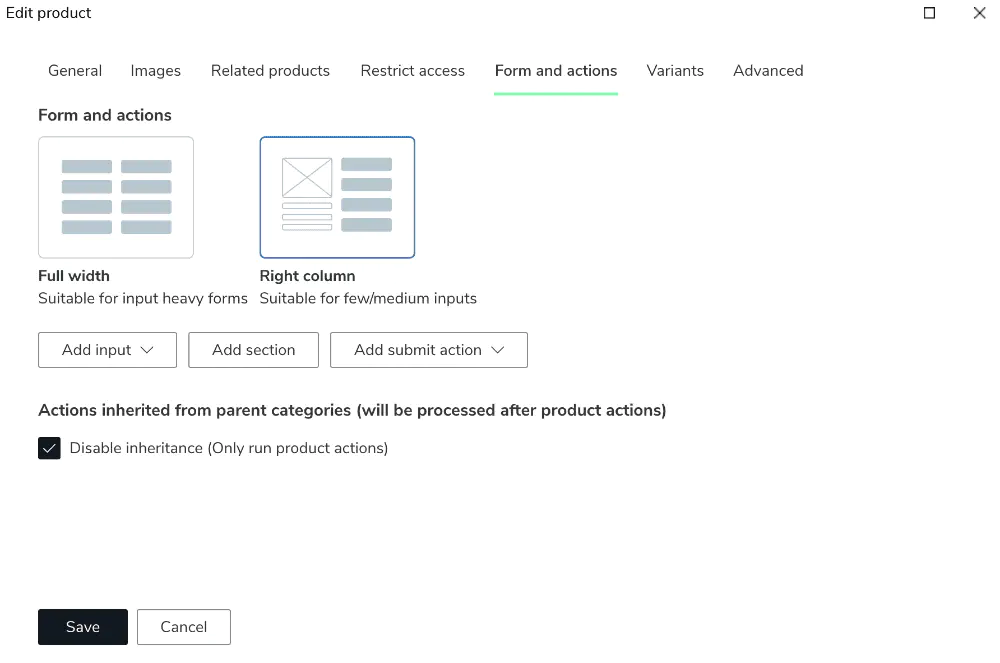
The configuration area includes:
- Full width: Displays the form below the product description.
- Right column: Displays the form beside the product image and order button.
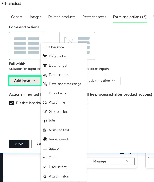
- Add input: Add input fields (text, checkbox, dropdown, etc.).
- Add section: Group multiple inputs into a section.
- Add submit actions: Add actions like email, approval, or group membership changes.
- Disable inheritance: Ignores category-level actions for this product.
Display Type
You can choose between two main form display types:
Full width – Best for detailed forms, feedback forms, or complex workflows.
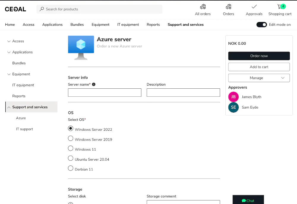
Example: Full width displayRight column – Ideal for compact configurations or simple inputs.
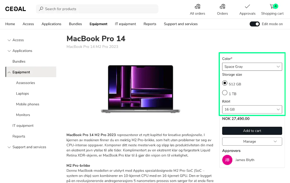
Example: Right column display
Input Configuration
Before looking at the specific input types, it’s useful to understand some configuration options common to all inputs.
Use Input Full Width?
When the form display type is Full width, each input field normally uses 50% of the width (two per row).
Check Use input full width to make a field span the entire width.
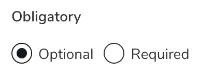
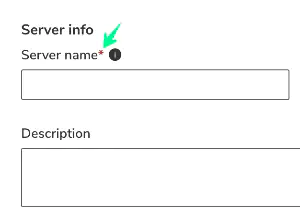
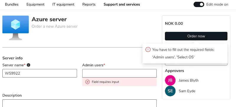
Obligatory (Required Field)
You can make an input field required by toggling Obligatory.
Required fields are marked with a red asterisk and validated upon submission.
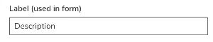
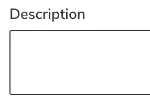
Label
The label is the name of the input field shown to the user.
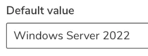
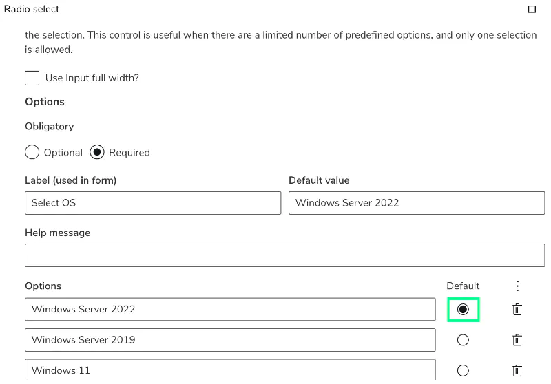
Default Value
You can set a default value for dropdowns, text inputs, or radio selections.
For dropdowns and radio buttons, click the default icon next to an option to preselect it.
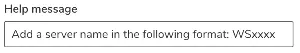
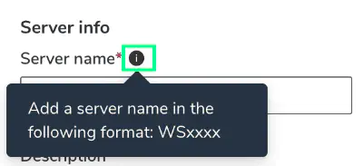
Help Text
Use Help text to provide additional information to the user.
An info icon appears beside the field label — the text displays when hovered.
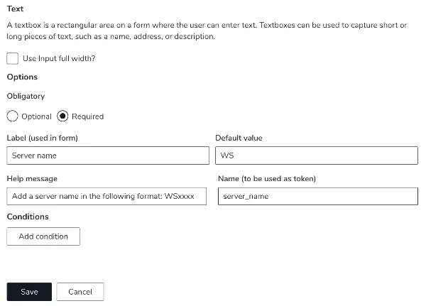
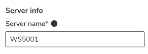
Name (Token)
Each input can have a Name (token).
This allows its value to be reused in actions — for example, inserting it in an email or approval message.
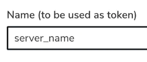
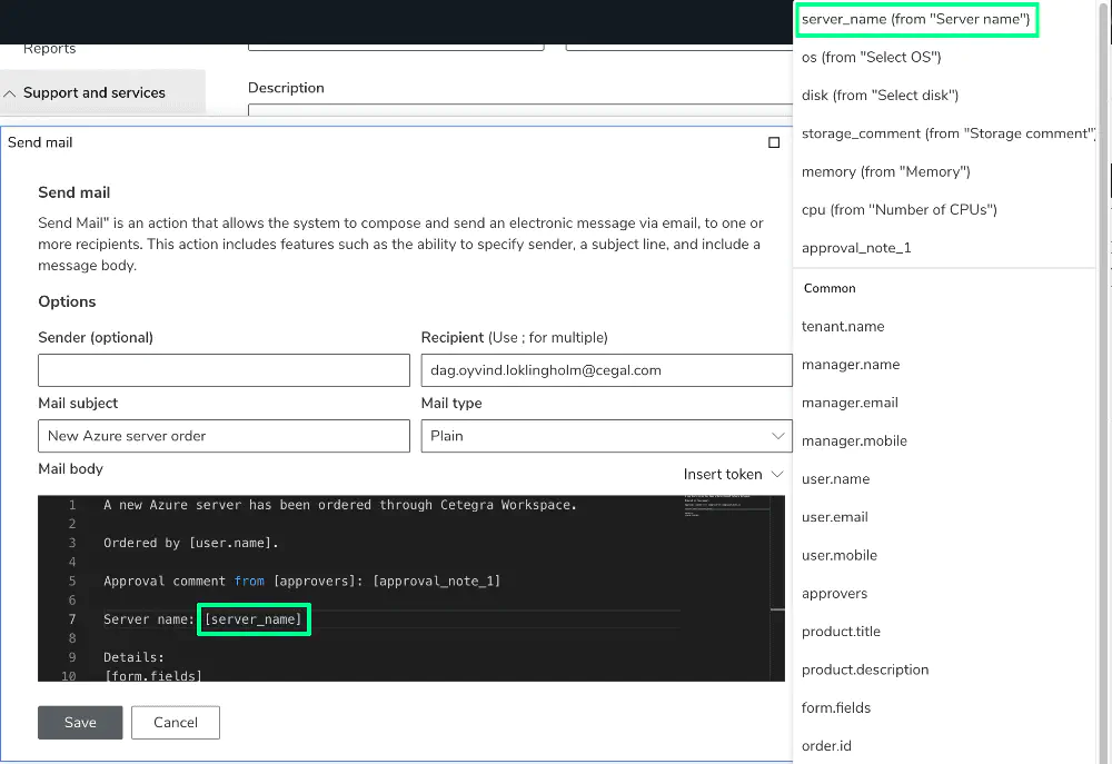
Example: The input server_name used in an email action.
Read more about tokens here.
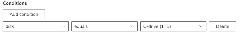
Conditions
You can control when an input (or section) appears using conditions.
Conditions support equals, not equals, in, and not in, and can be combined with AND / OR logic.
All named inputs can be used as condition rules.
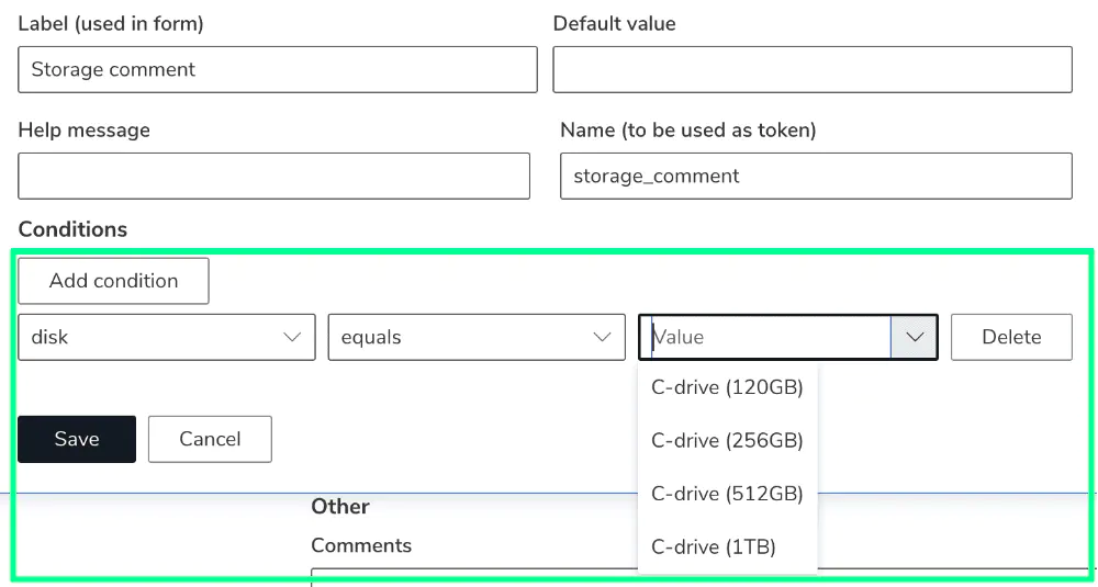
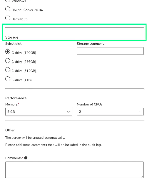
Example: The field storage comment is only shown if disk size is set to 1 TB.
You can also apply conditions to sections, hiding or revealing all inputs within that section.
Input Types
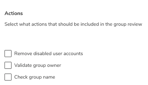
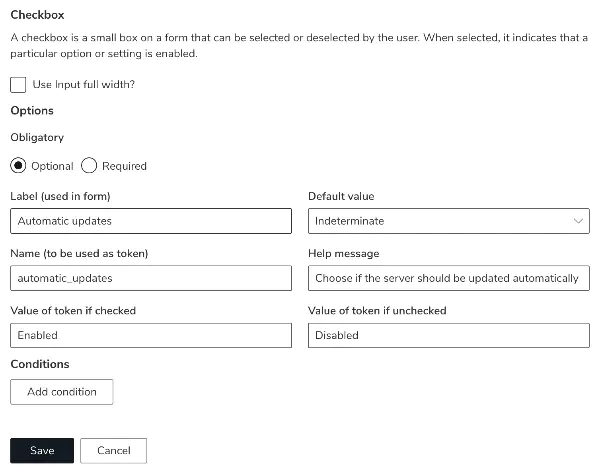
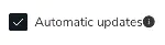
Checkbox
Allows the user to select or deselect an option.
You can define the stored values for checked and unchecked states.
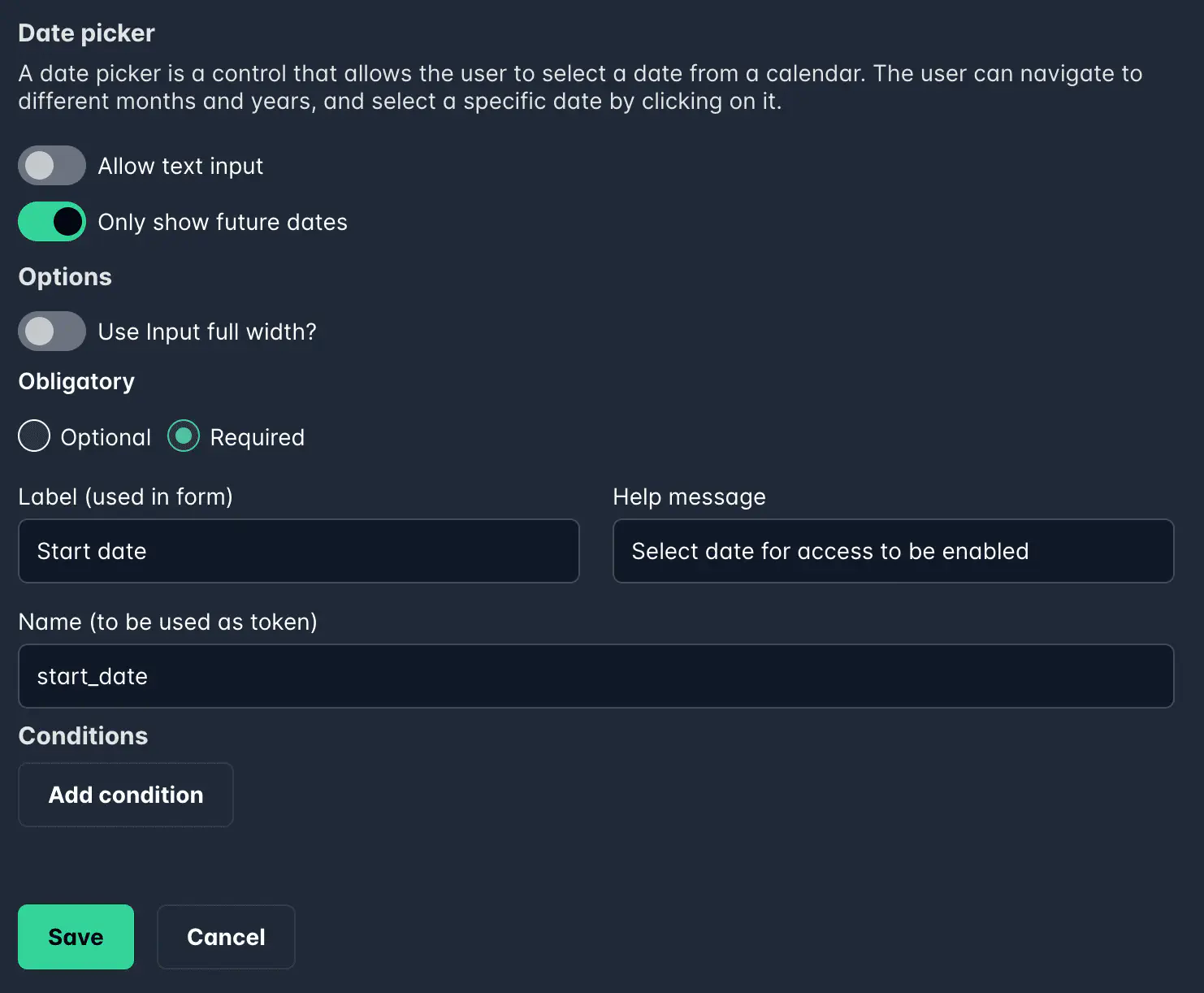
Date Picker
Lets the user select a single date.
You can restrict selectable dates (e.g., only allow future dates) and enable text input.

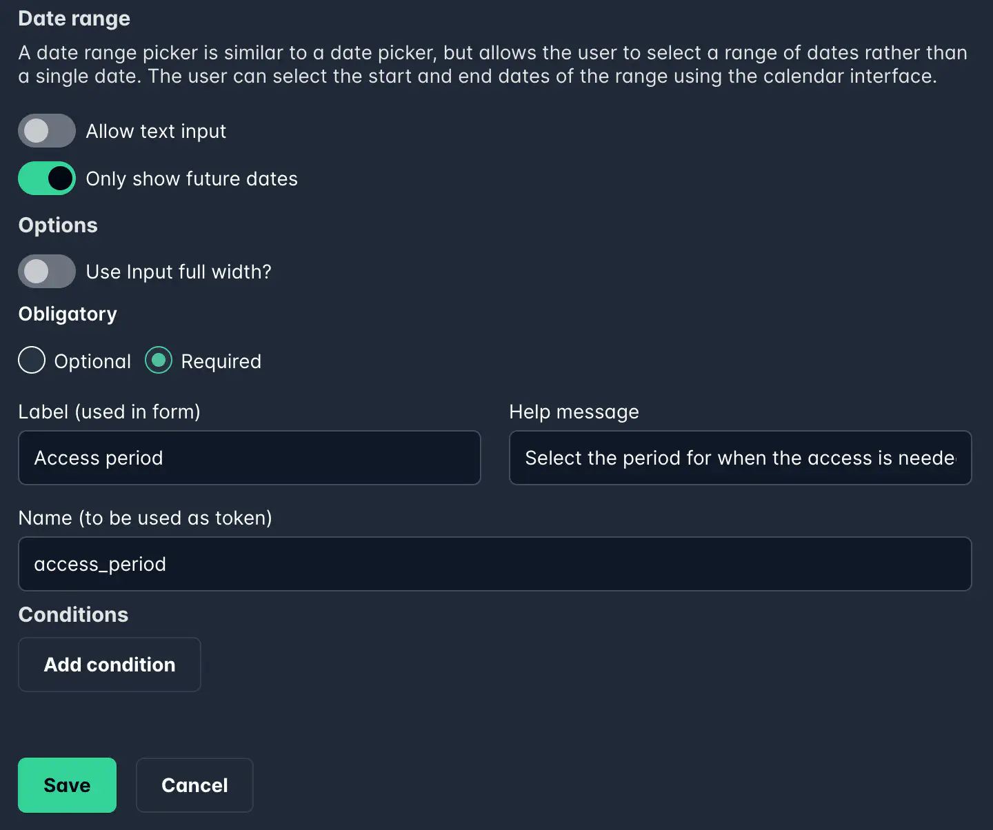
Date Range
Allows the user to select a start and end date.

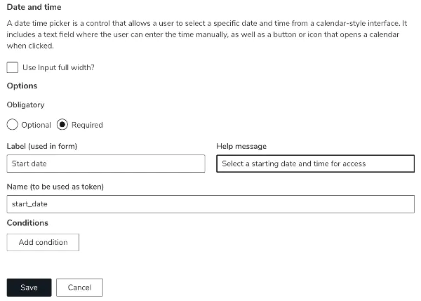
Date and Time
Allows the user to select a specific date and time.
The time is entered manually.
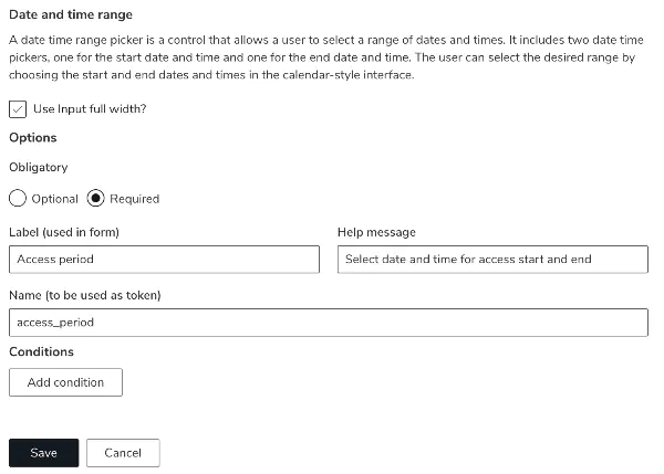
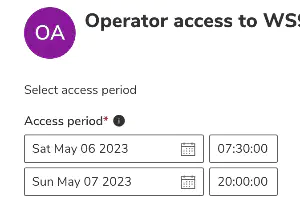
Date and Time Range
Lets the user select a range with start and end date/time.
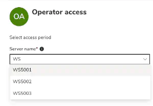
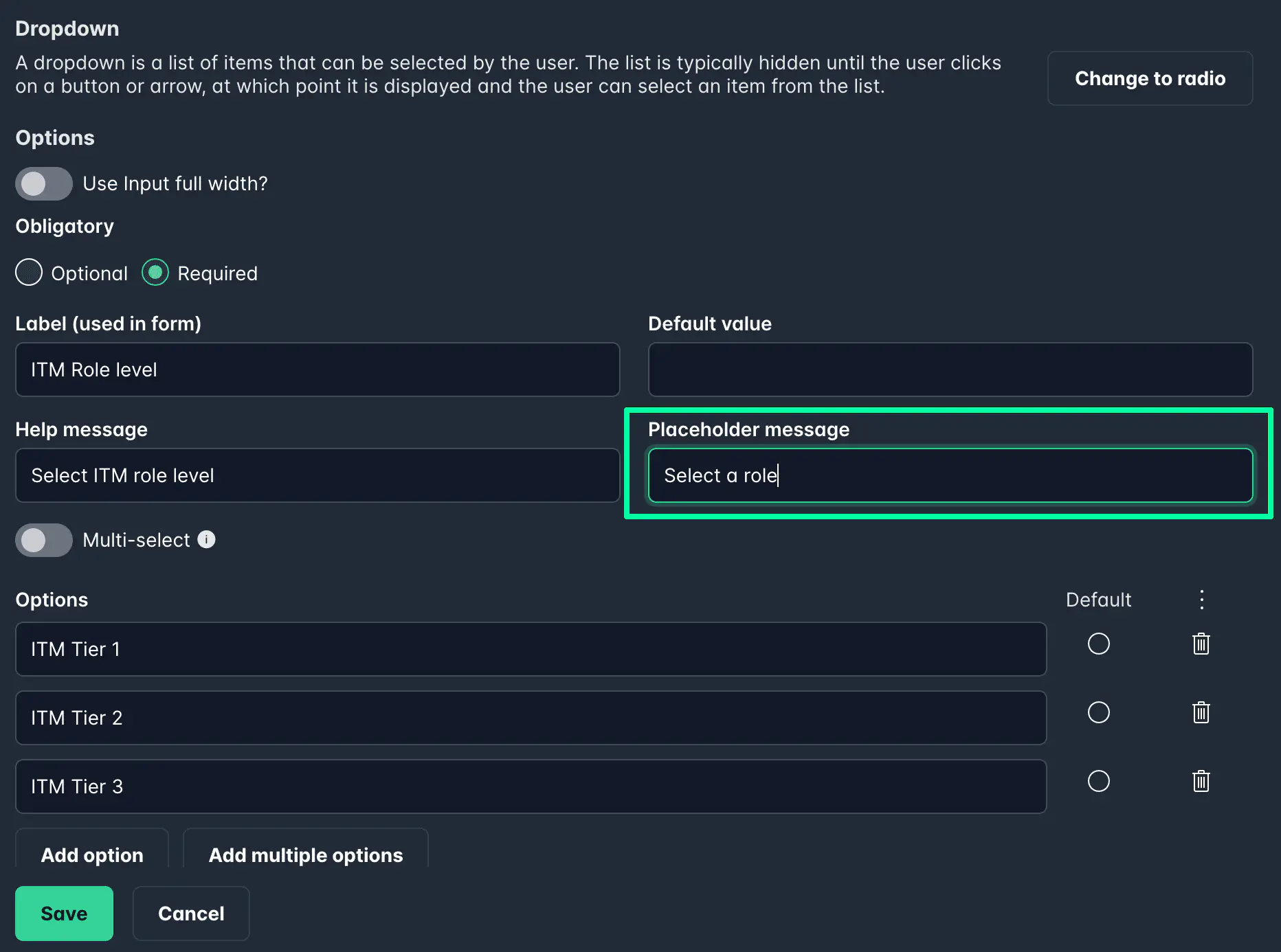
Dropdown
Select a value from a list of predefined options.
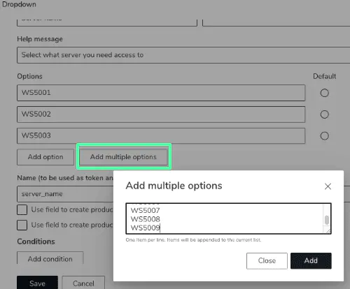
You can manually add options, bulk import from a list, and even allow searching.
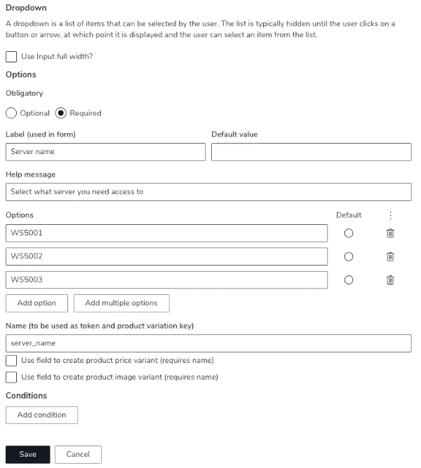
To add multiple options, click Add multiple options and paste a list.
To remove options, use the menu and select Clear all.
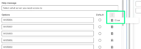
Dropdown values can also be used for product variants.
You can add a placeholder to guide users (default is Select an option).

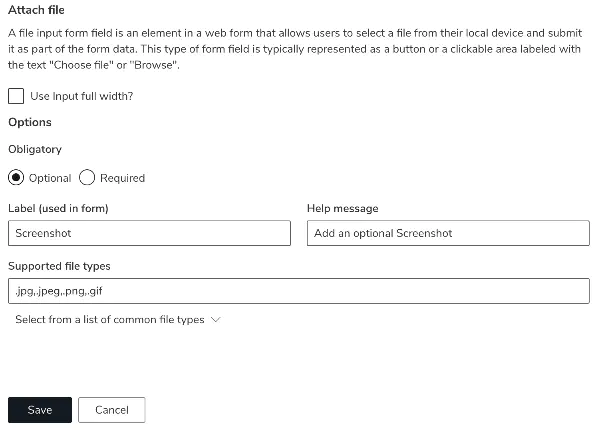
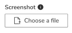
Attach File
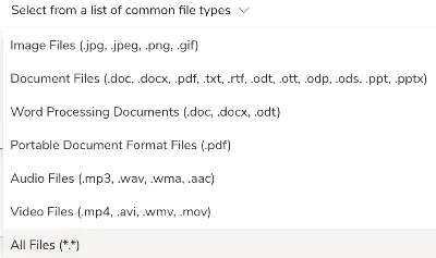
Allows users to attach a file to the form (e.g., documents or images). You can restrict allowed file types. Currently, one file per field is supported.
Attached files can be used with Send Mail actions — they are automatically included as attachments.
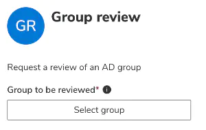
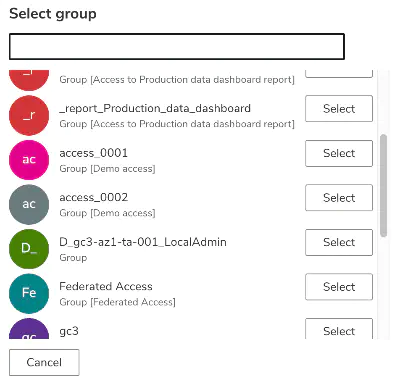
Group Select
Lets users pick an Active Directory group.

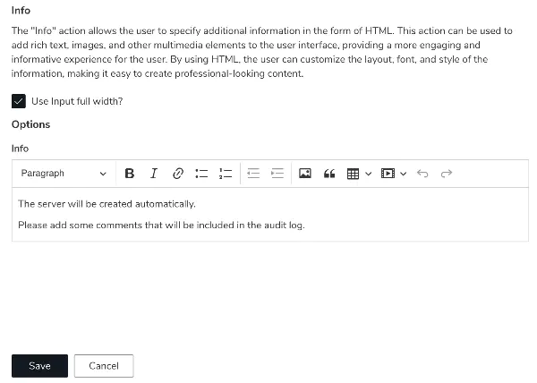
Info
Displays informational text directly within the form.
You can format it using the built-in toolbar.
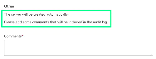
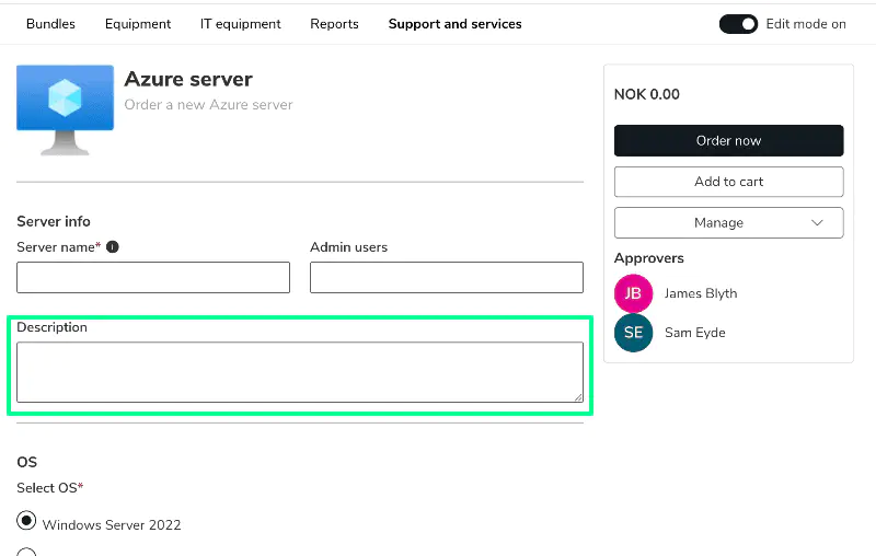
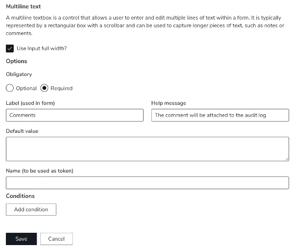
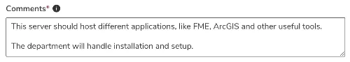
Multiline Text
Used for longer text entries, such as comments or descriptions.
Radio Select
Select one value from a list of predefined options.
Supports bulk import and search, just like Dropdown.
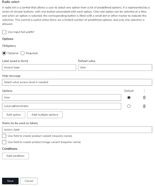
Radio selections can also be used for product variants.
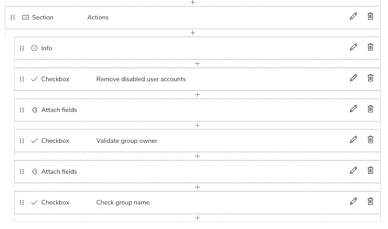
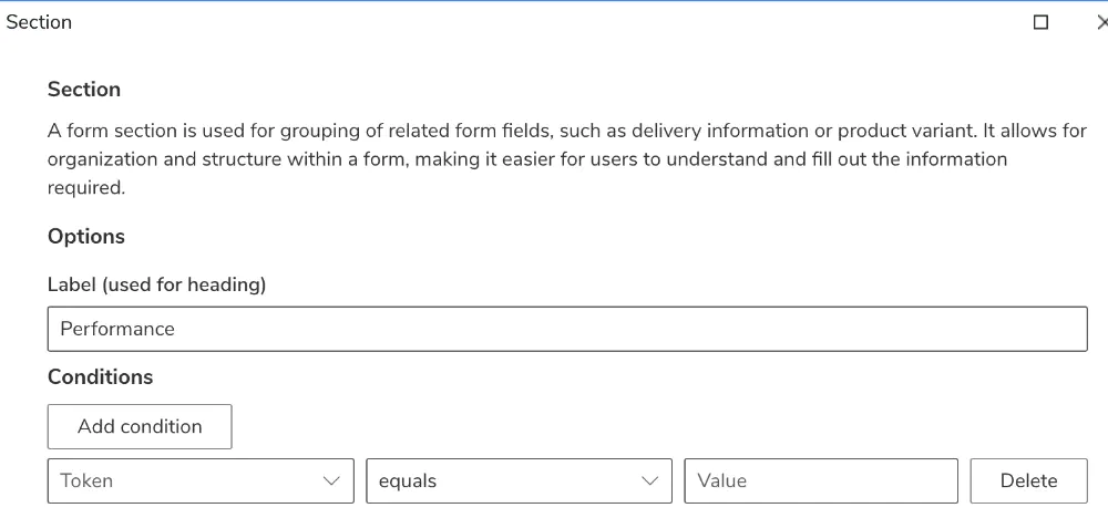
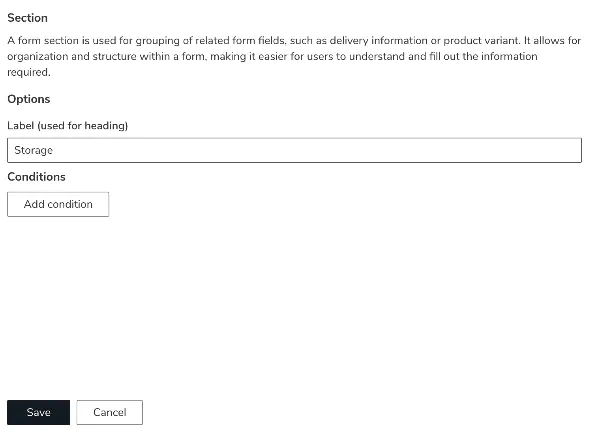
Section
Group related inputs under a header for better structure.
You can apply conditions to control visibility of the entire section.
Text
Used for short free-text input, such as names or short identifiers.
Validation
You can restrict what users are allowed to enter by setting a validation type on the field:
- None – No restriction. Accepts any text (default).
- Numeric only – Rejects non-numeric characters. Useful for quantities, IDs, or any field where only numbers are valid.
- Decimal number – Accepts numeric input including decimals.
- Phone number – Validates that the value matches a phone number format, reducing errors in contact data.
- Email – Validates that the value is a properly formatted email address.
- URL – Validates that the value is a properly formatted web address.
- Custom (regex) – Lets you define your own validation rule using a regular expression. You can write the regex directly, or use the built-in AI assistant within the input config window — describe in plain language what you want to validate, and it will generate the correct regex for you.
📷 Add screenshot here
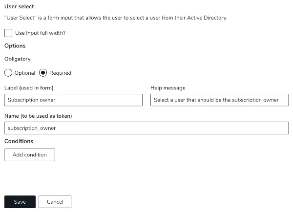
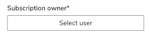
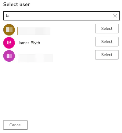
User Select
Lets the user select a person from Active Directory.
The User Select input can be used for token-based approvals.
Attach Fields
Used to visually “attach” multiple fields together so they appear as one block.
This is useful for combining checkboxes or related inputs in a compact layout.